Epilogue
by Hannah Baklien
Graphic design is physical. There are tools, there is touch and the design often takes on a kind of physical state at some point of the process. This tactility, materiality and the physical aspects, was the starting point for producing the graphic design artworks for Gender*Language 01.
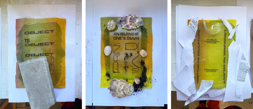
The theme of objectification is interpreted in the most literal way possible: by using actual objects as a tool for printing. The objects used are each connected to the different contributions presented on the Gender Language website – either mentioned in text or associated with the project somehow. When printed, these objects (a stone brick, sea shells, human hair) provoke shadows and shapes you can sense in the finished artwork.
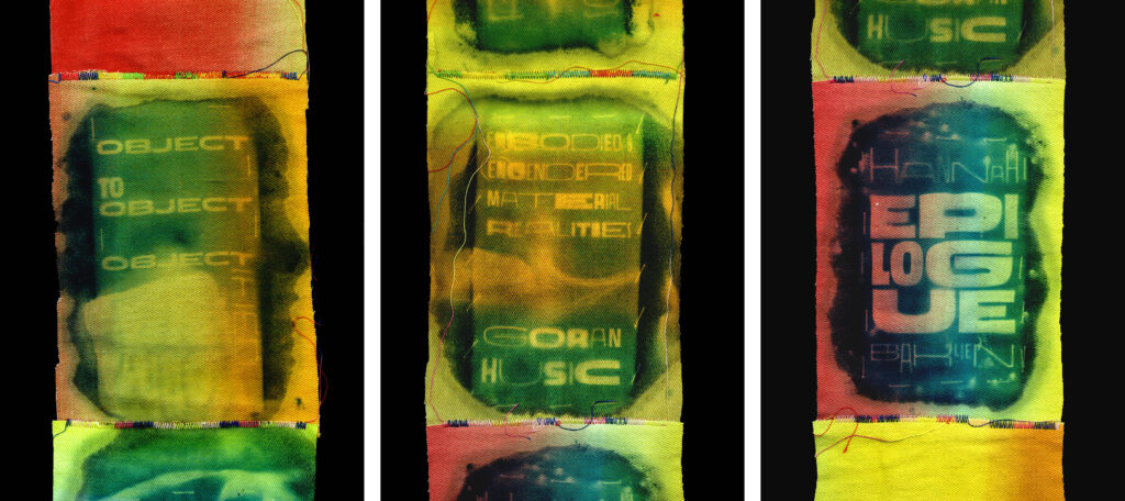
Finished cyanotype prints with titles and names of contributors. Printed on cotton fabric and sewn together as one scroll.
The prints are accomplished by using the 17th-century technique of cyanotype printing: an analogue printing technique that allows you to print using sunlight as the only exposure. Learning a new technical skill and being unprepared for the result means welcoming both risk and chance. Combined with the use of physical materials, it forces me to find new visual ways beyond the predetermined settings of software and screens.
Using the sun as exposure during wintertime in Sweden means no direct sunshine, or hardly any daylight at all. The process almost proved to be too risky — even when embracing the possibility of the unexpected. Instead of the anticipated exposure time of five minutes, the prints had to be exposed for 48 hours to produce any kind of visible image.
Initially, the plan was to glue printed text sheets onto objects soaked in cyanotype liquid – which would merge the text around the objects. But after experimenting with printing on different kinds of materials and shapes (noodles, wood, plastics), I eventually realized that the technique was best suited for natural fibers such as paper and fabric. On non-natural materials, the print would completely rinse off alongside the chemicals during the final stage of the cyanotype process.
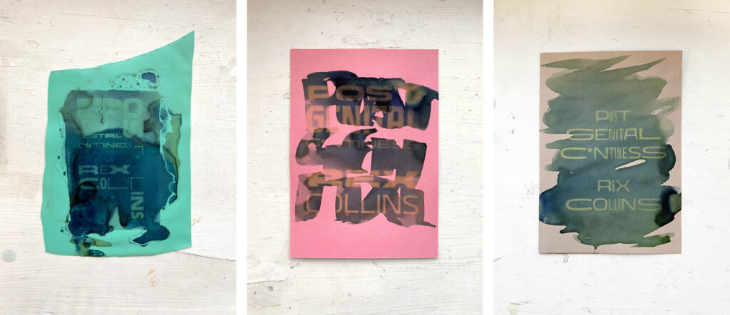
Some of the first printing experiments; printing on latex and paper.
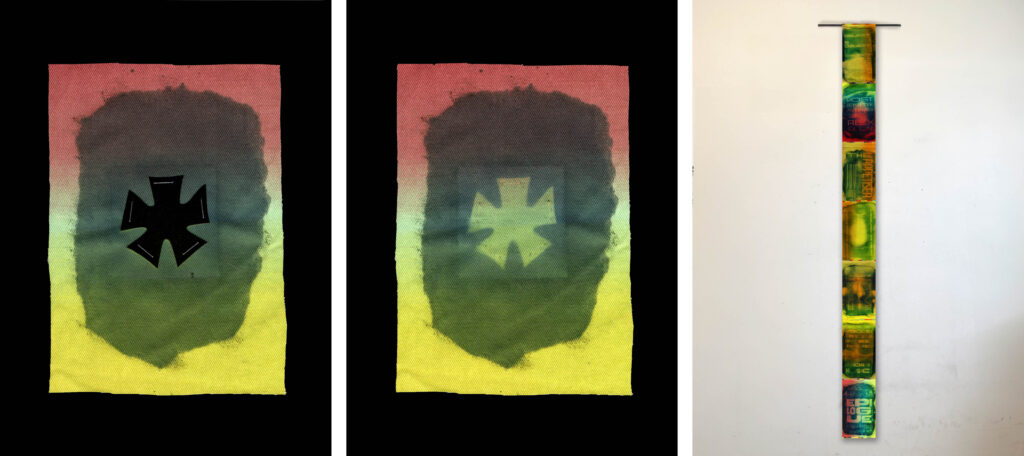
Instead, I decided to use the physical objects as part of the exposure. By covering areas with the objects and making these parts unexposed to the sun, I created shadows of the objects on the print. Portions of text are printed with black ink on plastic sheets, leaving the typographic parts of the finished prints unexposed. Titles of artworks and artists are set in the typeface Puffling by Ro Hernández, which is described as “our little queer utopia, a diverse family of weirdos ready to tell all those stories that don’t quite fit the common types”. Puffling comes in many weights and is born out of the crafty hands of linocut.
The chemicals of the cyanotype process automatically make the final print blue. However, by using a multi-colored fabric as a printing surface, I was able to add more colors. The final print is the actual size of the project presented on the web, bringing the very digital ratio of 1920×1080 px into the physical world and then transporting it back again.